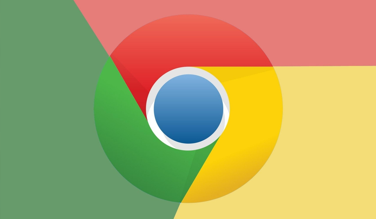
Google is preparing the redesign of its Chrome browser logo, the first since the last change introduced in 2014 and which shows a simplification both in shape and proportions as well as in color.
The new browser logo will arrive soon to users, after introduction in the Canary test channel, where developers can already see it, according to Google Chrome designer Elvin Hu.
The continuous design simplifies the main icon by removing the shadows that until now accompanied the limits marked by the three color stripes. The proportions were also redefined and the colors (red, yellow and green), which are more vivid.
These subtle changes are meant to align with Google’s “more modern” image. Hu also explained that they have adapted the new icon design to different operating systems.
Chrome on ChromeOS displays “more vibrant colors without gradients”, in line with the rest of the icons. In Windows (10 and 11), for its part, those slight gradients do appear, while in MacOS it adopts a three-dimensional appearance.
“We tailored the Chrome experience to each operating system, with features like Native Window Occlusion on Windows, M1 support from day one on macOS, Widgets on iOS/Android, and Material You on Android,” Hu detailed about the subtle changes.
K. Tovar
Source: Sport